
Recently I worked on a 360° illustration of an Izakaya in Daryl Qilin Yam’s Kappa Quartet and I was asked if I could share a bit more about the process of doing such an illustration.
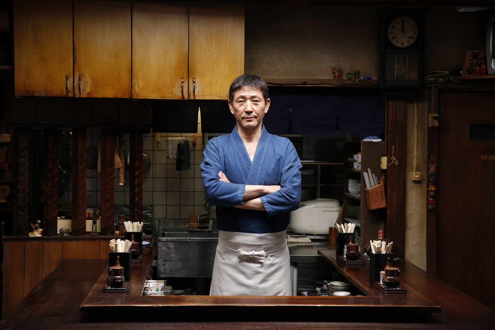
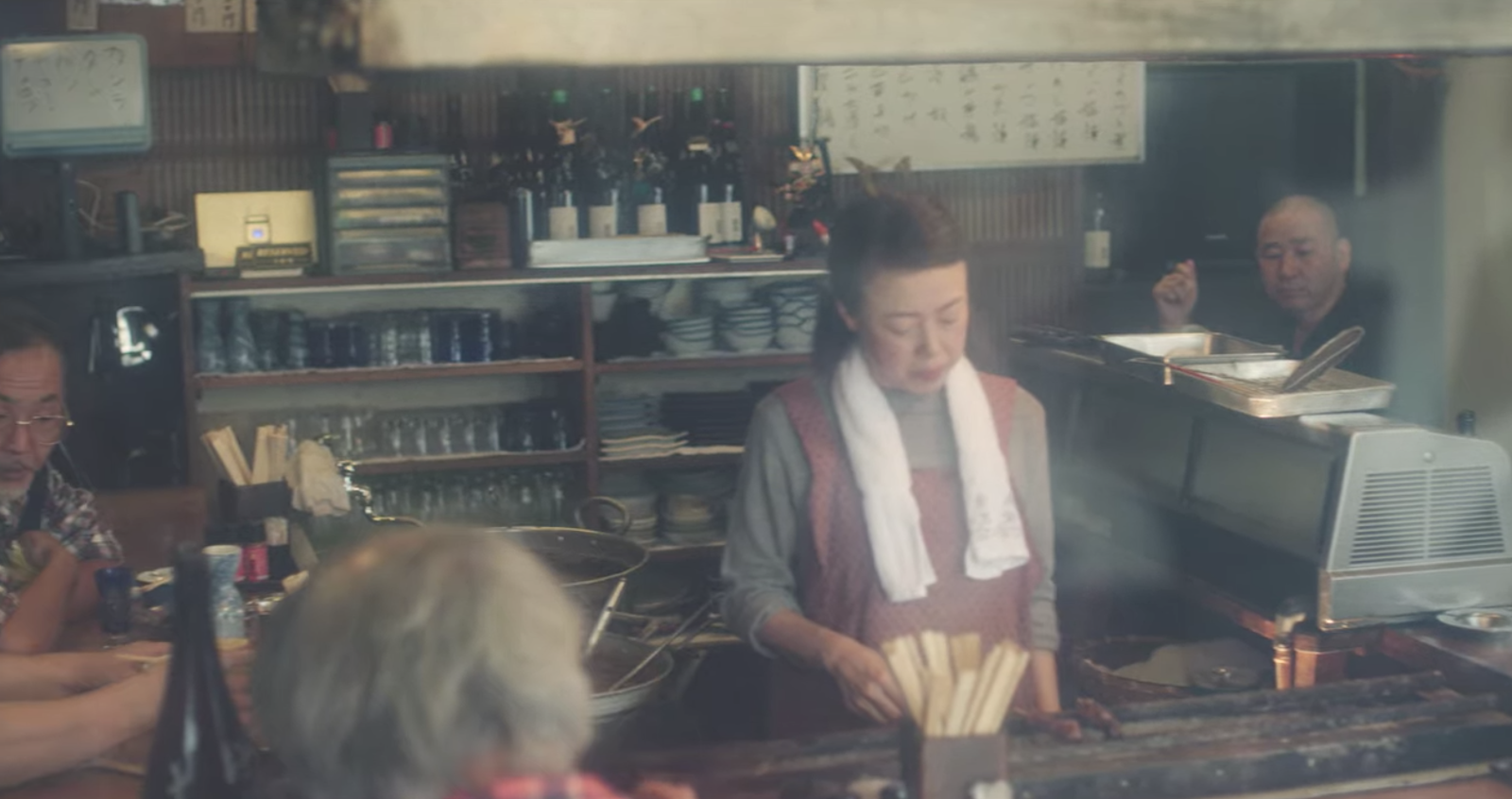
Artistic disclaimer: It just so happened that I watched a lot of Midnight Diner at the time when I was doing this illustration, so those spaces were definitely in my mind’s eye. There was also the show Samurai Gourmet which was a bit tiresome to watch, but had a few good shots of a traditional izakaya too. Alas, although I have visited Tokyo several times before, at this point I haven’t really been to a bar or izakaya in some years now…
Some things I realised from these portraits of izakayas is that when in doubt on how to fill the bar space, you can put stacks of tiny crockery or cover it up with a cupboard!

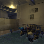
Another disclaimer: Where 3D modelling is concerned, I mainly design spaces and architectural/interior renders and I’m not a character designer! This will probably be apparent to people who actually do proper animation / character design because here I chose to render all the other people in the scene in this weird white low-poly form. Personally I thought it a good fix for my weakness and also that it kinda worked for this ‘horror’ piece…
Initially I thought that I would actually try to do the entire drawing by hand because I have actually enjoyed doing similar illustrations entirely by hand in the past – especially with lens distorsion like this:


2 illustrations from the set of 4 that I was commissioned to do for the Commuting Reader
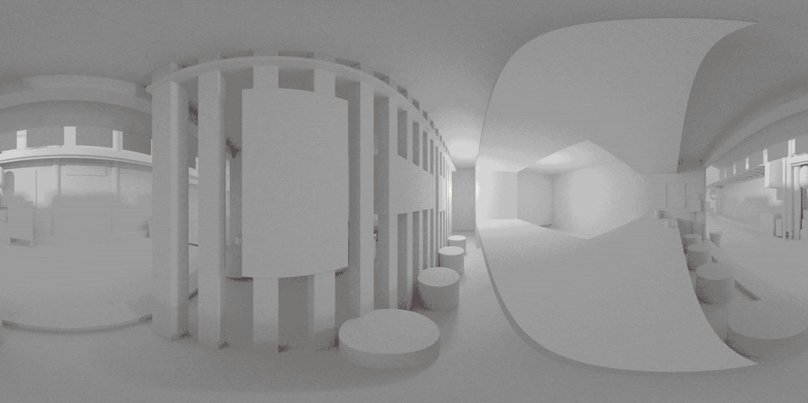
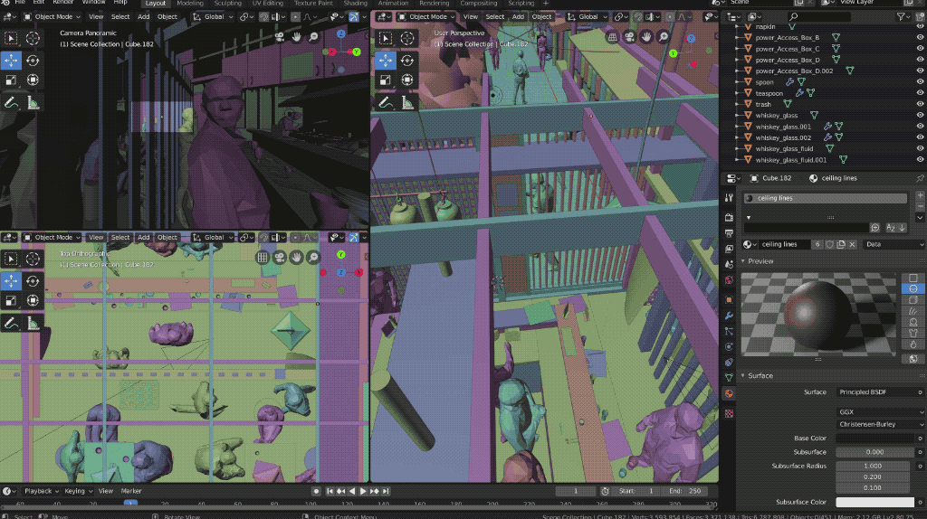
I usually work out a lot of the alignment for this kind of illustration by doing a 3d model using a fisheye or panoramic lens. After arranging white blocks in the space and rendering it out, I just use those lines in the render as perspective reference for my drawing.

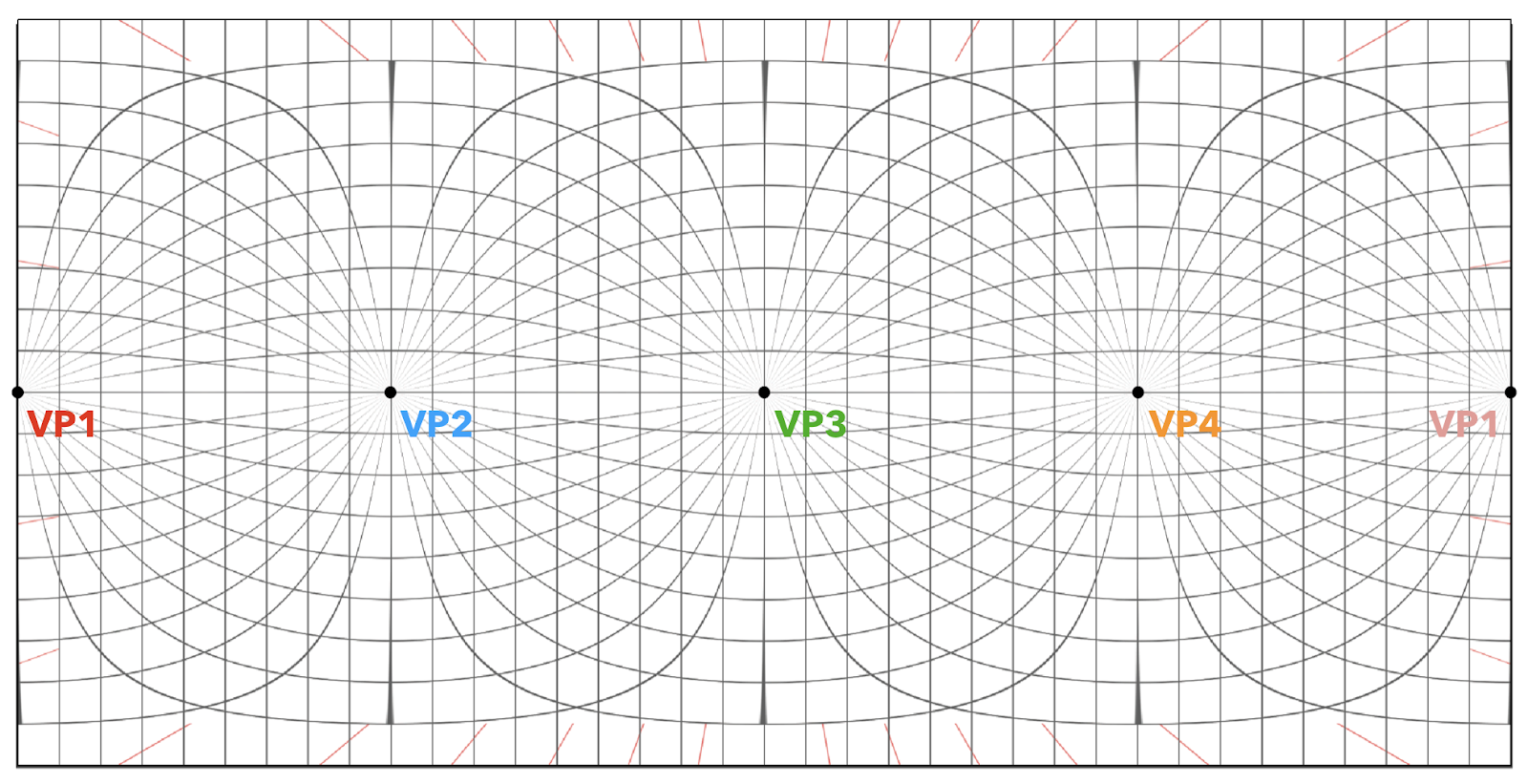
And for all other details that you need to fill in by hand, you can rely on an equirectangular grid (here is a link to an equirectangular grid by David Swart that you can use as a template) and think of it as a 4 point perspective drawing as so:
Here’s a 4 hour sketch I made using the grid for the fun of it in 2018…
(Back when I had a lot of free time huh)


Problem right now is that feeding and caring for Beano made it extraordinarily difficult for me to be able to use the tablet or cintiq. If left to her own devices, she wants to pull on all the type-c cables and gnaw on my stylus and then slap my cintiq screen! Attempts to set up my workstation in the bedroom so I can use the cintiq when she’s asleep have failed in baby safety. In fact I’ve more or less resigned myself to the fact that spending time with the tablet is impossible now – WHO WANTS TO BUY A MEDIUM WACOM AND/OR A CINTIQ PRO IN EXCELLENT CONDITION??? – and I’ve had to streamline my time spent designing, thinking of the fastest way to get the visual output. Hours spent doing digital painting like in the old days? Not happening anymore. A blender render is all I can muster now, which is great because whilst I feed and entertain Beano, I can easily set a render going so that I feel as if my illustration is partly doing itself whilst I’m busy…
I also use a renderfarm to speed things up a bit and I usually do a smaller resolution render to check that things are alright before doing the full size. At the 50% of the resolution I wanted it cost about 40-60 US cents (0.85 SGD) for each one. For the final render at 100% resolution and twice the samples, it cost about 4 USD (5.60 SGD).

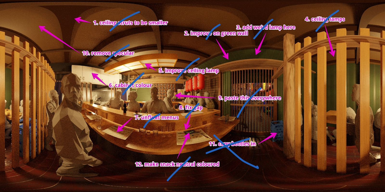
I don’t know how most people do the next step but I usually go through a process of annotating my renders and then ticking them off in Monosnap through as I do the edits:

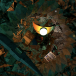
Finally we end up with the base render onto which I can add faces and other details in Photoshop. I do find that adding a bit of noise (0.5%-2%) also helps make it more ‘painterly’ because when the render is too sharp it becomes a bit disconcerting and unreal. I also drop the file periodically into this equirectangular viewer to see if the work is shaping up correctly – usually common issues might include (1) some things in the image that seemed further away may suddenly seem extremely close to the camera view or (2) items may be blocked when you render the specific view – so some time needs to be spent finetuning the arrangement.
This was another work made possible by the Dingparents who came down to take care of Beano on the weekends so I could continue my artistic pursuits! I am grateful to have the time to continue to make my work.
Come see the final image at Textures: A Weekend of Words, at Sorta Scary Singapore Stories by Tusitala.

13 – 22 Mar
10am – 10pm
The Arts House
Textures: A Weekend of Words celebrates Singapore literature and its diverse community. No longer a solitary experience, reading becomes a shared adventure through performances, installations, and workshops that will take you on a trip through the literary worlds of local authors.
The third edition of the festival takes on the theme “These Storied Walls”. Inspired by The Arts House’s many identities as a Scotsman’s planned estate, our nation’s first parliament, and now Singapore’s literary arts centre, the walls of The Arts House have been etched with the stories of those who have walked these halls.
This year’s programming features more installations and participatory activities that invite you to go a step further — move a bit closer and look a little longer. As you discover undiscovered narratives of your own, join those who have come before and weave your story into the tapestry of The Arts House.
Textures is co-commissioned by The Arts House and #BuySingLit, and supported by National Arts Council
More about Sorta Scary Singapore Stories
Related posts:
 Memory Portals: The process behind the work
 Landscape Renderings: Should the light come from the left or right?
 Upcoming DebbieTalks in September 2013
 VOID: Documentation and Process
 Data Mining Jurong: The process behind the work
 RENOVATION FOR THE D’OUTH HOUSE – Part 1: Flat Viewings, Online Research, HDB Resale Flat Purchase Process, & HIP Options
 “Telepathy” / “Pedestrian Racing” (Documentation of Work, Goodman Arts Centre, Sept 2012)
 Dream Syntax: The Book – PREORDER IT NOW!