In a landscape painting, where should the light come from? should it come from the left or the right? To make a generalisation, it seems that people prefer to have it lit from the top-left, and maybe it seems more natural to come from the left because of the dominance of right-handness. As a right-handed person, my tendency is also to look to the left first rather than the right; I lean on my right hand when writing and look to the top left of my screen first. Likewise I find that as a right handed person my distance estimation in a mirror is better when the mirror is to the left rather than to the right. Most digital canvases start from the top left.
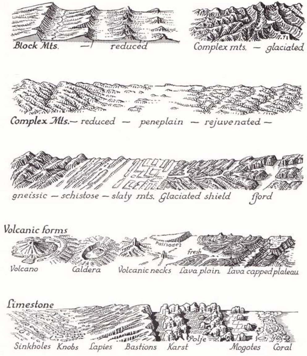
The convention for most maps is also for features or relief to be shading with lighting coming from the top-left or left. In this example of Erwin Raisz’s topographical symbols, you will see the mountains shaded with light coming from the left.
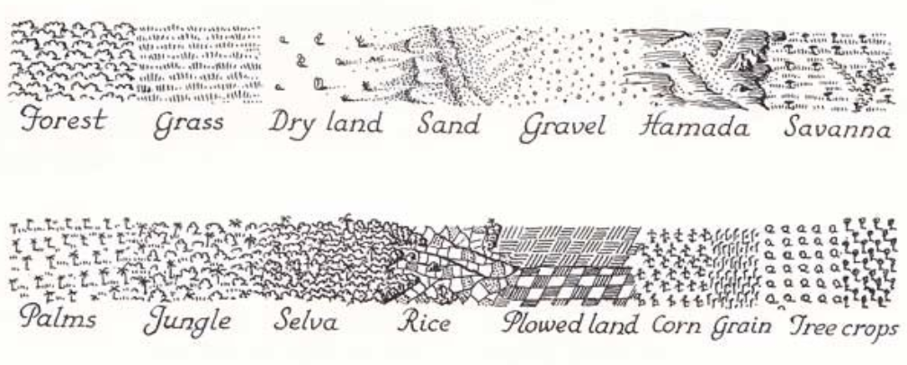
Even the teeny tiny trees have their shadows cast as if they were lit from the left.
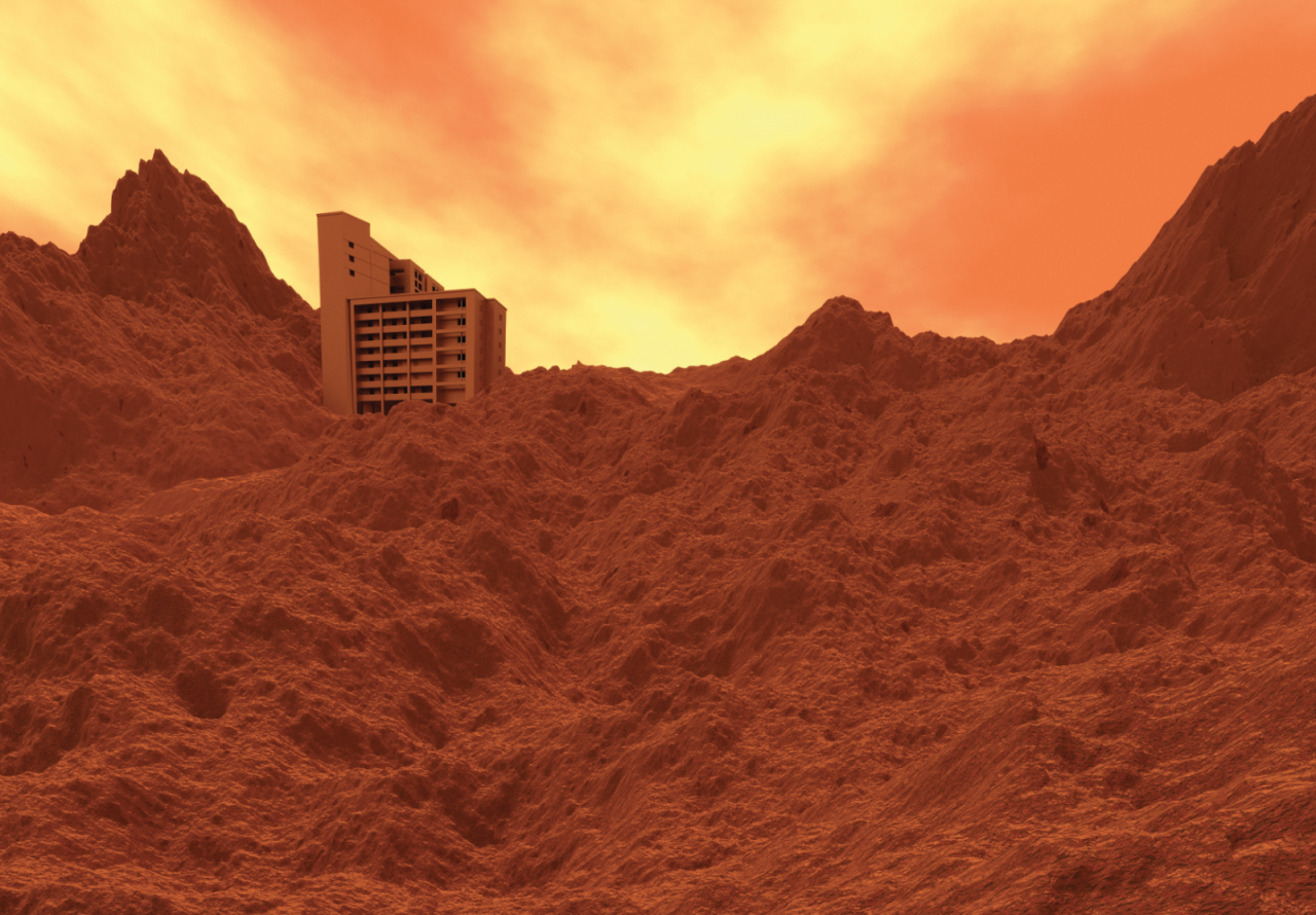
In my first render, I set the sun on the left of the scene, copying the lighting from the illustration on the back of the $10 note. This was the only way to achieve the diagonal shadows on the building features as depicted on the $10 note.
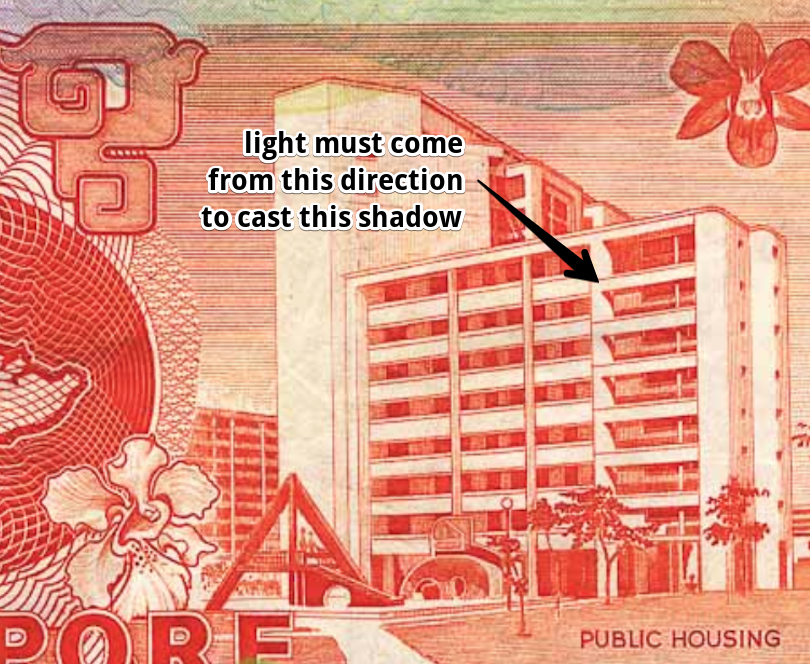
However, when I positioned the light this way from the left (as adhering to conventions), I didn’t feel the lighting on the overall landscape was working even though it allowed me to achieve the same lighting on the illustration on the $10 note. Then I thought that perhaps the only reason the illustration was drawn with the light coming from the left was because of CONVENTIONS DICTATING THAT LIGHT SHOULD COME FROM THE LEFT. I also didn’t like doing a ‘ghostly’ red to match the illustration on the note. That was weird and incongruous. No, I wanted the building hewn out of the same material. (Also the camera field-of-vision was another thing which distorted my building although I had followed its design closely in the render).
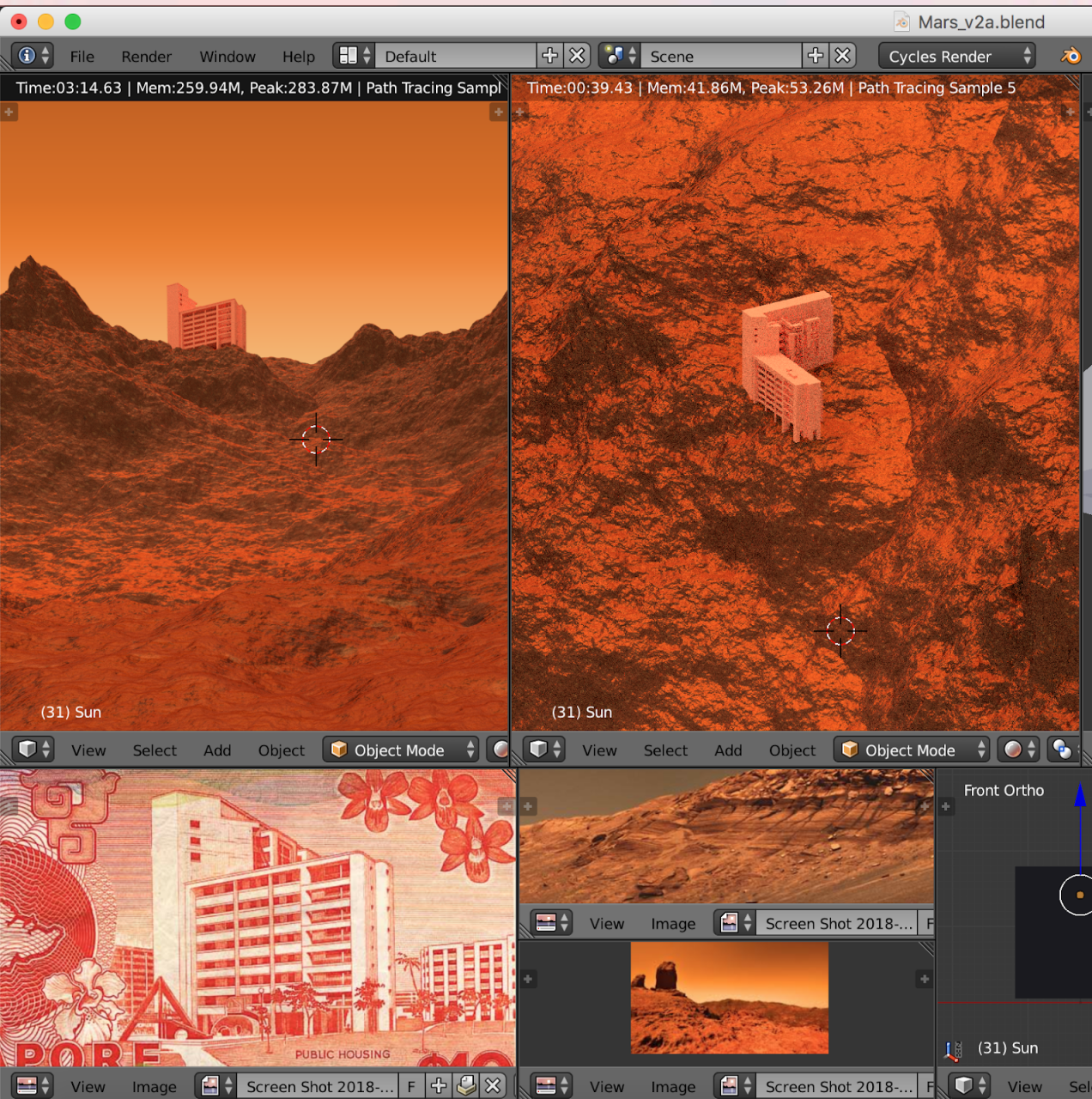
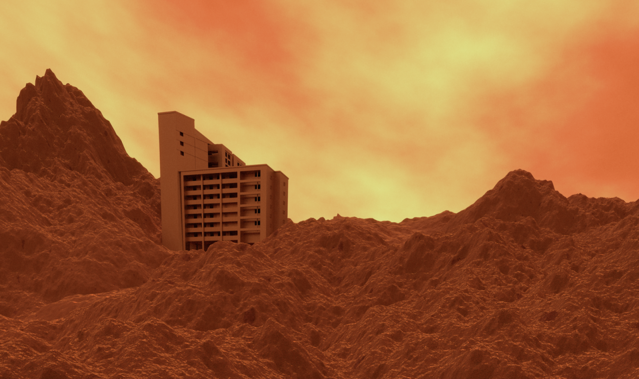
And thus the final lighting looks like this… the light comes from the right because I don’t need my landscape to feel natural or conventional and to be honest I just like it when it comes from the right.
Another thing worth noting when you are printing large backdrops is that most backdrop stands that you can find on the market will do 10ft. There’s a reason for this – most printers can only print on 10ft material. Furthermore, even if you get a 12ft pole, the long poles will sag in the middle due to the sheer weight of the item. So if I printed my work all over again, I would not do 12ft again because it is TOO HUGE.

Come see the work I produced for the President’s Young Talents 2018 show!
8Q @ Singapore Art Museum
8 Queen St, Singapore 188535
Gallery 3.12 (Level 3)
4 Oct 2018 – 27 Jan 2019

