Viewing audio spectrums in audio editing programs like Audacity can be unpredictable as it may frequently crash or hang because the program/computer can’t handle the processing required to analyse and display the spectrogram. And after you get the graph, what do you do with it? After the data is visualised, how can we get to the data and break it down?
Sonic Visualiser is apparently a program explicitly built for viewing and exploring audio data for semantic music analysis and annotation. I downloaded it recently and found that it worked incredibly fast and was also full of many useful annotative functions and could also run “feature-extraction” plugins (eg: beat trackers, pitch detection, etc).
I guess I am following this line of thought because I am interested in how we can analyse sound data meaningfully. Detecting beats, pitch, vowel sounds, and other audio features is something that has fascinated me since I once saw a documentary about deaf children in 1970s France, where children were apparently trained to speak using a computer game that made children learn the subtle difference between speaking different vowel sounds. Although the children in this programme were profoundly deaf (often from birth) and could not hear anything at all, they were being physically trained to produce the right vibration and sound through their vocal chords, aided with this motivational computer game that moved the character up/down/left/right according to the sound that was emitted. The vowel sound for “A” would move it up, the vowel sound for “E” would move it to the right, the vowel sound for “U” would move it down, and so on so forth. So it would be, a sort of dream, to find out how to create such a program on my own.
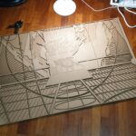
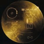
I downloaded Sonic Visualiser and put in an audio file generated by Metasynth which was meant to have a spectrogram that resembled the cover of the Space Voyager record. (Read more about my attempts at converting images to sound)
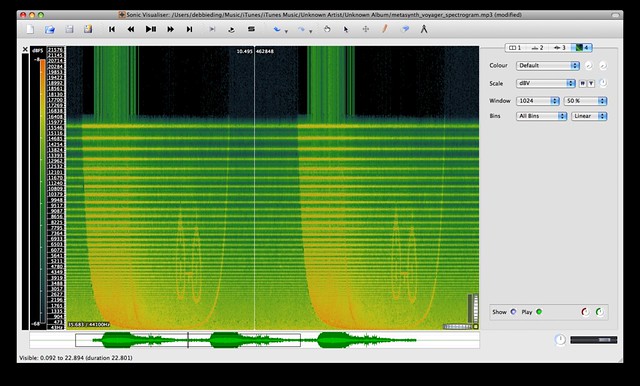
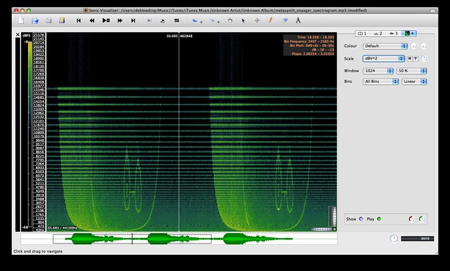
dBV^2: “The scale displacement is proportional to the log of the square of the bin value.”
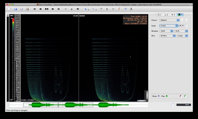
Linear: “The scale displacement is proportional to the voltage level of the resulting audio output.”
DECIBELS: The dB is a logarithmic unit used to describe a ratio of a physical quantity in reference to a specific level. The ratio may be power, sound pressure, voltage or intensity or several other things.
“In professional audio, a popular unit is the dBu (see below for all the units). The “u” stands for “unloaded”, and was probably chosen to be similar to lowercase “v”, as dBv was the older name for the same thing. It was changed to avoid confusion with dBV. This unit (dBu) is an RMS measurement of voltage which uses as its reference 0.775 VRMS. Chosen for historical reasons, it is the voltage level which delivers 1 mW of power in a 600 ohm resistor, which used to be the standard reference impedance in telephone audio circuits.
My Observations/Ponderings:
- are those what we call “noise artifacts” in the spectral analysis process? why are there more colours on certain “scales”? why the fuzzy bits of sound scattered across the graph from what sometimes sounds just like a singular tone?
- how should we choose a frequency scale? which frequency scales bring out the most striking visual images? is this like the RGB channels for images? in RGB images we can say that the red channel tends to contain the “human skin tones”, the green tends to contain the high details, and the blue tends to have the noise – is there a similar thing in sound analysis, where viewing sound on different scales produces visual graphs that emphasise particular details in a similar manner?
- how is colour assigned? there are many different possible colour palettes available, but how do these programs do it? are there also different scales involved in applying colour effects to the sound spectrogram?
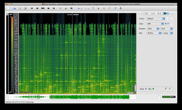
for example, this is a portion of the analysis of dopplereffekt’s the scientist. the track itself is fairly minimal and it is very crisp and clean, mostly just DUK CHK DUK CHK DUK CHK DUK CHK. still, this spectrogram is pretty colourful and i can’t quite yet look at the spectrogram and imagine the sound from it. perhaps it will take more reading to understand why it looks this way or how to optimise and format the spectrogram output.
In other news, I am currently trying to understand digital sound processing by watching this lecture series on Signals and Systems, released on MIT Opencourse Ware. Got to Lecture 2, was promptly stumped by the first equation. First time I saw the symbol phi. Actually, how the hell do you even type phi? Looks like there is no way to type phi in a mac keyboard. You have to copy paste it in or find the symbols panel (greek) and then add it in. ϕ
The lecture begins talking about a continuous time sinusoidal signal but in the real world a lot of the common digital signal processing that goes on apparently involves discrete signals, eg: music on cds, mp3s.
Signals can either be continuous time (eg: analog) or discrete (eg: digital). Digital audio is sampled and the sampling rate determines how many of these discrete signals we record down.The resolution determines how “detailed” the recorded signal can be. An 8-bit code has 256 possible combinations, a 16-bit code would have 65,536 combinations.
Next, this data has to be analysed so it makes sense as sound. There is no “simple” way to do spectrum analysis for sound and most oscilloscopes do not give any information about the timbre of sound which needs to be understood more as differences against the scale of frequencies whereas we record sound against the scale of time with an oscilloscope. The main method used to analyse sound into something that becomes “digital sound” is the “Fast Fourier Transform” which appears to involve a very much more complicated algorithm….

